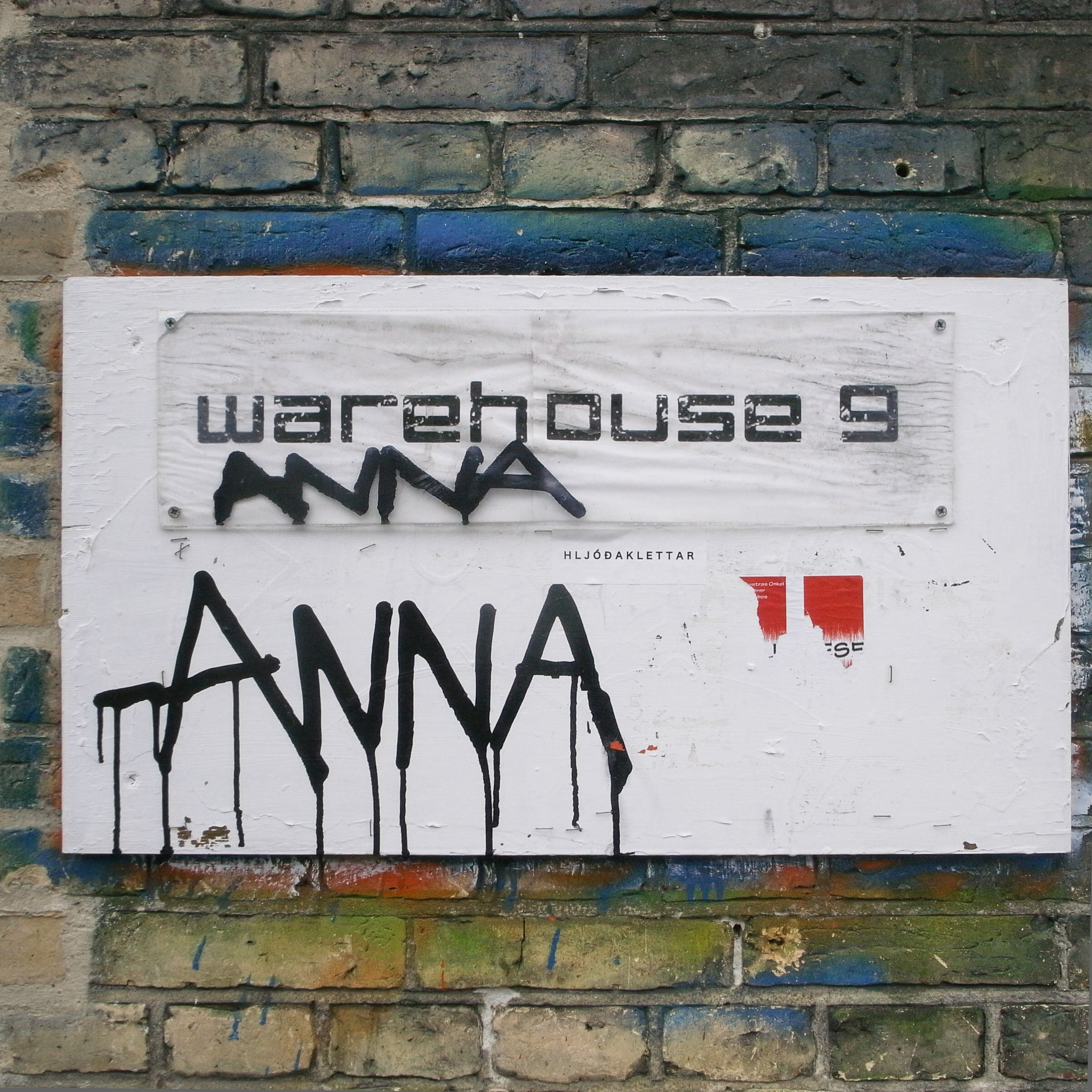
In a simpler world, logos were straightforward and referencing names in text was a piece of cake: “regular” names followed title case and acronyms expressed their concise selves in all caps.
Today usage of case in branded material (including all-caps, start case, title case, sentence case, and lowercase) is dictated not exclusively by rules of grammar but also by media-based typographic conventions, legibility factors, and grammar-neutral aesthetic principles. In fact, letter case format in brand names today is mostly a product of the designer’s preference for font-specific letterforms coupled with client perceptions of a wordmark’s “attitude.” Thus, lowercase logos tend to come off as relatively more modern, unpretentious, discreet, and informal than uppercase ones, which are better for communicating that a brand is loud, decisive, or powerful. Logotypes rendered in traditional title case can help a logo come across as classic, timeless, and elegant.
That is all as it should be. A logo, after all, whether it’s a badge on a box or a stamp on a page, is a context unto itself: here I am, it proclaims—and this is my name.
Problems arise, however, whenever a non-standard letter case variant is lifted from the logo and applied to the brand name when it occurs in regular text. Use all-caps and the name looks too much like an acronym (especially if it is a neologism) or like something you’re yelling (especially if it’s a familiar word or phrase). Use no caps and the name disappears—or infuriates, for example if your caps-free name ends up starting a paragraph or sentence. Some opt for marking their unconventionally case-styled name using color, italics or bold, but since these are typically used for emphasis and not demarcation of lexical class, they call undue attention to the altered text without solving other problems (like a pesky sentence-initial non-capital).
When a brand name appears on its own, without contextual support from the logo, it benefits from following the general rules of capitalization that apply to the text as a whole. Like the CEO’s name (scrawled in self-effacing lowercase, perhaps, when it is her signature on company paper...), the brand name, too, deserves grammar-grade title case treatment.
Clients are resistant. But it looks wrong, they say. We created a whole brand around avoiding that capital letter. Won’t it be confusing? Not as confusing as the alternatives, actually. Keep in mind that we’re all used to caps morphing to lowercase in URLs and e-mail addresses, anyway. Having a logo that puts a fresh spin on the letter case of your otherwise grammatical name is preferable to insisting your avant-garde name get special treatment in every context.
My name as it is written in the title of this website is one such example. Indeed, it’s styled as lowercase—but make no mistake: the name is Osiatynska.
